Case study · 2026 · Therapy platform
Safe Space
Designing a calmer path to mental wellness.
About
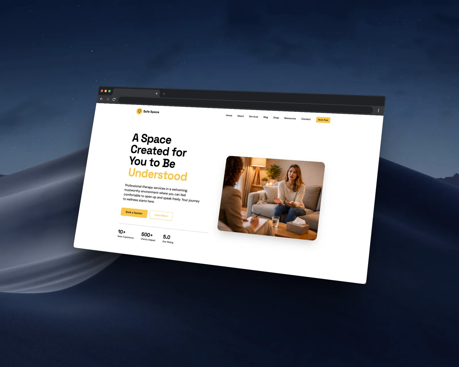
Safe Space is a concept therapy platform built to explore what mental health care could look like when the design gets out of the way. It gives people one calm place to book sessions, journal, track their mood over time and set personal goals, without the noise most wellness apps pile on. Every screen was built around one question: does this make the user feel more at ease, or less?
Who it’s for
Someone who wants mental health support but keeps running into barriers: a packed schedule, the discomfort of in-person visits, or apps that feel more like productivity tools than safe spaces. It’s designed to be low-pressure and consistent, not another dashboard to manage, so showing up feels like the easiest part of the day.
Challenge
Most mental health apps try to do too much. They fill screens with features, progress rings and streaks that create pressure instead of relieving it. The challenge was restraint: an experience that felt supportive without being clinical, and structured without feeling rigid. That meant stripping the interface down to what matters, letting calm typography and spacing do the heavy lifting, and making every interaction feel intentional rather than automated.
- 98Lighthouse performance score
- A+Accessibility rating
- 12+Custom React components built
Brand identity
Color palette
Golden Yellow
Primary: CTAs, highlights and brand accent
Warm Orange
Crisis and warm emphasis sections
Cream Surface
Warm tinted section backgrounds
Light Gray
Card and input surfaces
White
Default page background
Near Black
Foreground: all headings and body
Typography
Display / Headings
Space Grotesk
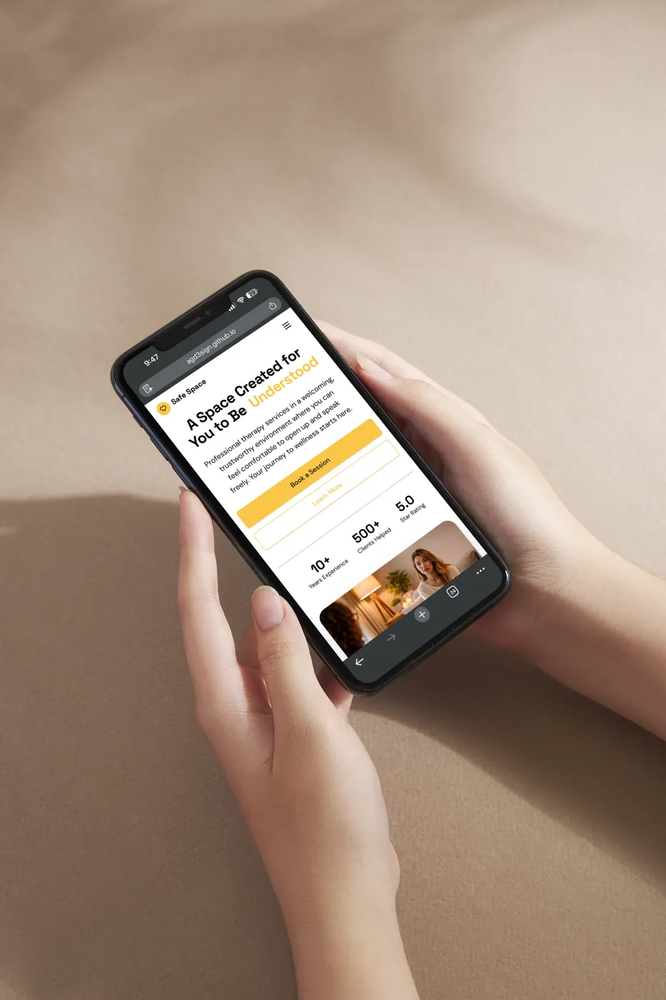
“A Space Created for You to Be Understood.”
Geometric and modern. Gives the UI editorial structure and quiet confidence without feeling clinical or cold.
- 300
- 400
- 500
- 600
- 700
Body / UI
DM Sans
“Book a session. Journal your thoughts. Track your mood.”
Friendly and highly legible across every screen size.
- 400
- 500
- 600
- 700
Type scale
| H1 | Space Grotesk · 700 | Hero headline | clamp(2–4rem) |
|---|---|---|---|
| H2 | Space Grotesk · 700 | Section heading | clamp(1.5–3rem) |
| H3 | Space Grotesk · 600 | Card heading | clamp(1.25–2rem) |
| Body | DM Sans · 400 | Body copy | clamp(1–1.125rem) |
| UI | DM Sans · 500 | Labels and nav links | 14px |
| Caption | DM Sans · 500 | Metadata and timestamps | 12px |
Buttons
Primary
Main CTAs · Space Grotesk 700 · golden yellow with dark text
Outline
Secondary actions · golden border and text
Ghost
Low-priority actions · light gray border
Badges
Success
Hours and availability status
Warm
Appointments and warm emphasis
Neutral
Secondary category labels
Border radius
- sm4pxTight elements
- md8pxInputs and buttons
- lg12pxStandard cards
- 2xl16pxFeature cards
- 3xl24pxHero and large CTAs
Shadows
- SubtleDefault card lift
- MediumHover state
- LargeModals and drawers
- Gold GlowPrimary CTA emphasis